
WATCHPOST
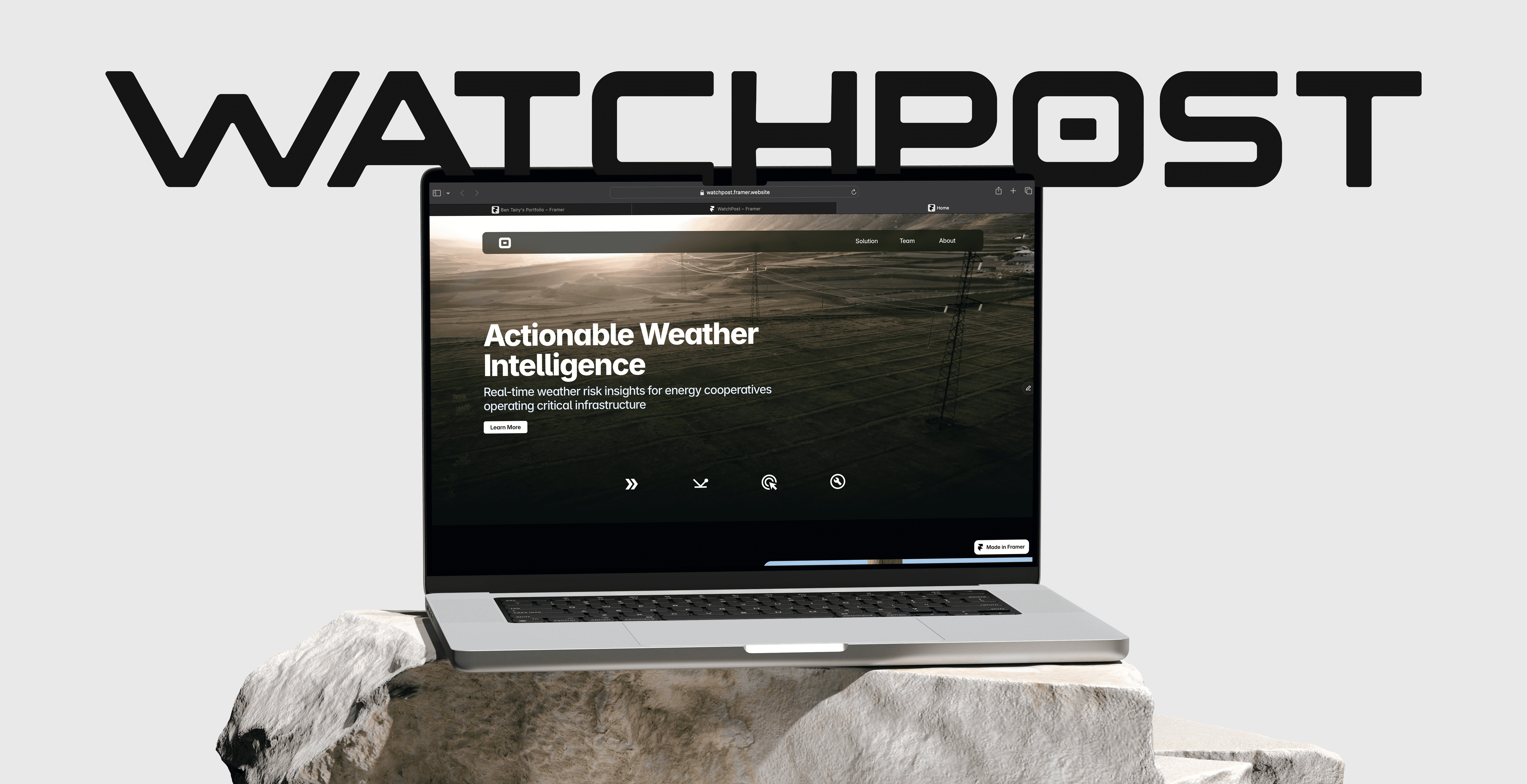
How I designed a branding system and website for a weather data company.
Deliverables: Logo, Favicon, Branding kit, Functional website,

first iterations
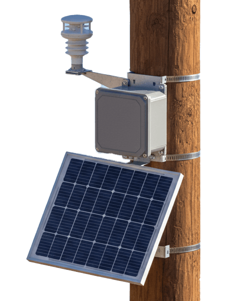
I wanted to emphasize what makes this product different, which is the close proximity of where the modules are installed. The first design choice I made was to put the letters close together, highlighting the idea of closer proximity. I also wanted the letters to feel heavyset and sturdy, so I played with the stroke and bottom of the letters to make them feel immovable and trustworthy.


First Branding Kit
This the first branding kit that was sent to the CEO for review. There was a lot of back and forth on this first iteration, which helped me refine the brand into something stronger and more representative of the companies idea.
Final Branding kit
The refined branding kit is much cleaner, and cohesive. The new favicon provides much more brand equity by being the "O" in the wordmark, and mimics the look of a target which represents the products mission to be more accurate than their competitors. The full word mark isn't as wide and feels more balanced now, and the final color palette feels better. Overall, the branding was a success and I was very proud of my process.